After five amazing years at Last.fm I decided to hand in my notice a few months ago, my last day was at the end of August. As a parting gift and sign of appreciation of the many things Last.fm has given me I produced a series of data visualisations of the scrobbles of all Last.fm staff, alumni, and community moderators I could find, and published it last week.
In total the series encompasses 8.7 million scrobbles across ~180 graphs. The visualisation is a structured heatmap that is designed to reveal periodicities: years, months, day of week, hour of day.
Storytelling With Scrobbles
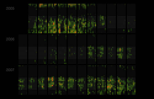 |
Excerpt of underpang's graph, showing the years 2005-2007. |
It is often most interesting to read either your own graph or that of someone you know well.
David Singleton published a blog post about his own graph, in which he writes:
Despite the depth of information its stunningly readable and rather interesting. You can pick out real patterns quite easily [...]
From my graph I was able to spot these behaviours:
- Mid-2005 to 2006 - Finished Uni, got a job and spent the first 6+ months commuting with iPod after moving to London was still missing a laptop for a long time.
- Late 2007 - An increase in evening listening, a sign of joining the Last.fm team and getting stuck in to startup culture of late nights.
- Early 2008 - Evening listening, but with more separation from daytime listening. I suspect this was nights spent playing albums with my flatmate Ben Ward.
- 2009 - Less evening music, which I think stems from different flat mates, a different flat and starting an (unscrobbled) vinyl collection.
- February 2010 - A quiet month for scrobbling, most of which on holiday in New York, little time for digital music.
If you don't know the person portrayed you will find it hard to recognise the stories captured by this visualisation. While you may see changes in behaviour they will be meaningless without the necessary context.
To make up for this I asked a few people to share what they can read from their own graphs, and published their notes in the form of an annotated gallery of Last.fm Heatmap Calendars. (David Whittle tells me this is a variant of a Diary Study.)
|
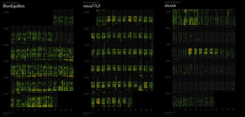
There is an amazing diversity of patters across the different graphs. Every person's graph has a truly characteristic shape. These are the heatmap calendars for BlueEgoBox, nova77LF, and alcxxk. |
Future Work
In principle this visualisation is applicable to all kinds of event streams, with a few limitations. It requires a fair number of events: graphs based on less than tens of thousands scrobbles often weren't detailed enough.
It works best for events that happen at least several times a day over a duration of years, and where event occurrence is at least moderately structured; entirely random events will just produce a noisy chart.
It could feasibly be applied to: IRC/IM/email communication, phone call logs, credit card transactions, WikiLeaks cables (by embassy or topic), software version control histories, transport data (e.g. produced by TfL's Oyster card or bike rental schemes), tweets, blog posts, transactions in markets and auction systems, and many more.
Links
- Annotated Gallery of Last.fm Heatmap Calendars
- The full Flickr set: Last.fm Heatmap Calendars
- Infosthetics post: Revealing the Periodic Listening Habits of last.fm Users
Comments
Hi Martin,
I liked a lot your visualization! Is the source code for generating those calendars available for open-source? I'd like to do this visualization using the the social network data from where I work! It's an educational social network called AtePassar from Brazil!
Regards,
Marcel
Marcel, 2011-09-13 14:24 CET (+0100) Link
Manuel,
not yet, maybe at some point. But send me an email at martin@dekstop.de and maybe we can work something out -- I'm not interested in making money out of this, I'm a curious person and always interested in exploring other people's data :)
Martin Dittus, 2011-09-13 15:48 CET (+0100) Link
To learn more about calendar maps, see my JCGS article and the supplemental material on the JCGS website: http://pubs.amstat.org/doi/suppl/10.1198/jcgs.2011.2de
Rick Wicklin, 2011-09-13 16:55 CET (+0100) Link
Thanks for the links Rick!
I only found out about your calendar maps after I had started on my version last year, and found it interesting to compare the approaches. Surprising that so few people are working on such structured heatmaps, in retrospect it appears so obvious :D
It looks like you're working on some amazing stuff. Good to see that you're receiving such a positive response. Let me know if you ever come to London. (The chances of me coming to NC are pretty slim...)
Martin Dittus, 2011-09-13 17:18 CET (+0100) Link
Comments are closed. You can contact me instead.