Recently there have been a number of requests for new ideas in the aggregator market, and as I'm constantly dissatisfied with my feed consumption experience (no matter the tool) I have lots of opinions on the state of aggregator software -- and even some ideas for improvement. I'll save the grand overview for later; because some things are better shown than told I thought a good start would be to show sketches of what I'd like to see in the next generation of aggregators. Here's Sketch One, which is kind of an accumulation of concepts, and which describes the basis of where I see aggregators going in the future. You've read it in the title: User-defined interfaces!
No, I'm not talking about custom style sheets. It's about more than that.
If you're impatient: jump ahead to the screenshots below, the following text is just a very convincing argument that builds up the tension.
The Problem: Too Few Cooks
I don't believe that one developer (even with the support of his peers and core users) should be the person to create what everybody else will use. For one, he's much too few people to implement all the other people's wishes, and second he'll make choices that you probably won't like, and which are hard to fix afterwards. I love it that there seems to be a lot of motivation in developers and consumers alike to improve the aggregator experience, but I'm a bit wary of the situations this might lead to.
Case in point: Nick Bradbury's path towards an attention-generated ranking of content for FeedDemon is important, but it has a flaw in that it's one guy (or a group of people) trying to decide what's best for everybody. Look at some of the formulas they kick around, and you'll see that it's all based on assumptions that might not (and will not) be true for everybody. It took me a couple of weeks of using SearchFox's attention-controlled feed ranking to find that I'd like to bend the process to a level that might not fit everybody.
The Solution: Let Users Participate.
So let other people create functionality! Think of Firefox, of its amazing extension mechanism. Look at TextMate, and try to learn from it. And that's what I did, and here's a first result.
What do we need to support user-created functionality? First we need access to an aggregator's internal data model; most of the existing aggregators provide that in some way or another. The registered version of NetNewsWire (which I'll use as an example environment for this article) has AppleScript integration. AppleScript is not so great, but it's good enough, and it's a well-established standard (at least on the Mac).
Additionally we'll need a way to display custom interfaces. NetNewsWire provides this as well: it's a full-featured web browser! And web browsers, as everybody is well-aware of, are the natural environment of new, innovative interfaces that can be implemented with little effort and a bit of technical expertise.
Then we'll need a way to connect the display to user-created functionality; I hope I don't spoil the surprise when I'll state that this is where NetNewsWire (and probably any other aggregator) falls short. You can't control its interface from an HTML page. But we only have to look at TextMate's custom URL schemes to see that there might be a way... if the developers want to support it (Vienna is looking more and more attractive now.)
An Example of a User-Defined Interface (which currently is nothing more than a visualization)
So let's try to live with the current shortcomings and come up with a first sketch. How about a little statistical analysis? Say, let's collect all URLs that articles in your subscriptions link to. Then extract each URL's domain name - and then create a histogram of those. Instant attention metrics, personalized to your reading behavior. Easy as cake.
I realize that the population of registered NetNewsWire users is smaller than the number of people interested in aggregators, so I'll try to demonstrate the result here as best as possible; but if you're an impatient registered user of NNW, jump to the end of the article and download the script.
Otherwise: Look at the screenshots below, and then dream of the possibilities.
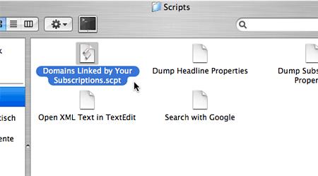
Step One: Place User Script in Script Folder
Download and unzip the script linked below, and put it in NetNewsWire's script folder.
 |
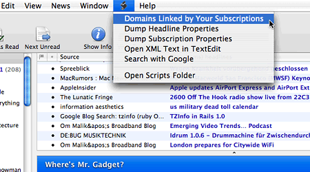
Step Two: Start the Script
The script will immediately show up in NetNewsWire's script menu, so let's start it...
 |
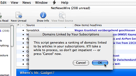
Step Three: Acknowledge Superfluous Disclaimer
... click OK...
 |
Step Four: Wait. And Then Wait Some More.
... and wait...
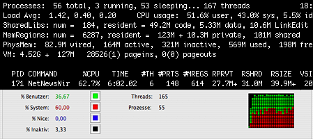 |
(Note to non-Mac users: these are illustrative screenshots of system monitoring tools, not of the analysis process itself. Other possible metaphors for passing time: clocks, watches, beach balls.) |
Step Five: Rejoice!
... and it's done. The script takes its sweet time, but it's worth it. The result of the analysis is then presented as HTML page within NetNewsWire's interface.
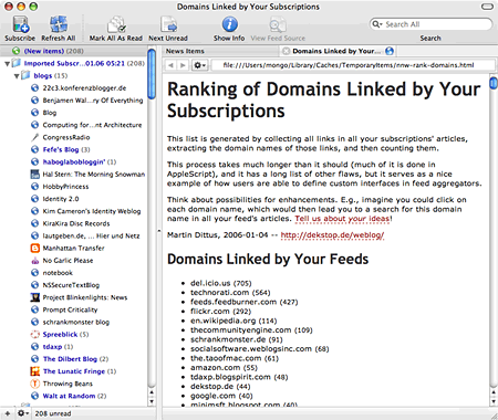 |
del.icio.us is the most popular link, who'd'a thunk. Mostly a result of subscribing to del.icio.us tag feeds; same for Technorati, thecommunityengine.com, and some others. |
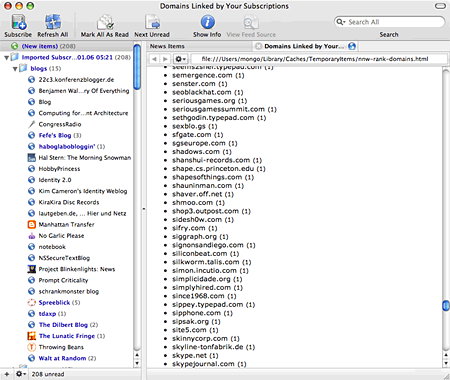 |
As usual the tail is more interesting. See the download links below for the complete histogram of my feeds as of today. |
Besides being a minimal demonstration of a user-created interface, this script also shows how NNW lacks scriptability: wouldn't it be great if each domain name in this list would be linked to a NNW-internal search? So that you wouldn't have to copy and paste a domain name string into the search field to see which naughty party animal linked to sexblo.gs, and why? Implementing this feature could be as simple as, say, getting NNW to understand URLs like this:
nnw://search?q=sexblo.gs
Of course there's even more room for improvement within the script itself -- doing the same analysis for only a subset of feeds (say, a folder or single feed) would definitely add interestingness to the analysis. As would colorful graphics and more interactivity, and most of all speed. But it's only a demo, yet it's a start.
Any Takers?
What do you think? Getting some ideas now? Let's hear from you. Post comments, implement your own, and most important of all nag the aggregator developer of your choice about what features you see lacking. Here's a good one: Displaying script output in an HTML view without the current detour of writing it to disk (cf. TextMate again, which can make use of script output in a variety of ways, all of them in-memory.)
And expect more of this from yours truly. You ain't seen nothing yet.
Download
- nnw-rank-domains.zip (AppleScript file, zipped, 12 kB)
- nnw-rank-domains.html (example output, 112 kB)
Comments
Cool stuff! Thanks for doing this!
About supporting URL schemes like nnw://, there are a couple problems, unfortunately:
1. Security.
People might find a way to do bad things -- or at least very annoying things -- since these links could appear in any HTML content.
2. It makes people insane.
There are people -- many of them vocal and highly intelligent -- who go nuts whenever anybody uses URL schemes in this way. They're probably right, too (though I'm personally neutral on the issue).
The upshot...
As a desktop application, NetNewsWire is designed to be scriptable via AppleScript. It's a safe bet that we'll add yet more AppleScript support in the future (we always have) -- and we've even thought about supporting other plugin interfaces.
But using URL schemes is probably not something we'll do (beyond the support we've already added for the "feed:" URL scheme).
Brent Simmons, 2006-01-05 01:47 CET (+0100) Link
Brent,
I see your point, still disagree -- but thanks a lot for the feedback!
martin, 2006-01-05 04:11 CET (+0100) Link
Comments are closed. You can contact me instead.