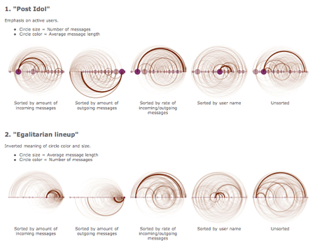
I just completed a simple visualization of IRC communication behavior, you can see the graphics at mardoen.textdriven.com/irc_arcs/ -- this is the analysis of about a month's worth of IRC communication on a single channel.
 |
I especially like irc_arcs_incoming.png (top left) -- it clearly communicates a number of interesting attributes (the strongest ties, passive recipients vs. active senders, well-balanced vs. one-sided conversations, ...)
The visualization concept is roughly based on Martin Wattenberg's arc diagrams (refer to his research page for the paper). But the semantics of these visualizations differ -- e.g., the element order of IRC arcs is not based on their sequence order in the original data.
Related Articles
- Visualization of Numeric Data: A Brief Historical Overview
- Back from Datenspuren 2006
- MidnightBot: When People Post
- MidnightBot II: 'No Errors?' (Hah)
Comments
Comments are closed. You can contact me instead.