I just got a copy of Edward Tufte's 'The Visual Display of Quantitative Information', and while I only skimmed over a few passages I found its historical examples of data visualization intriguing. A little searching then brought up "Milestones in the History of Thematic Cartography, Statistical Graphics, and Data Visualization", which is an interesting gallery and timeline of the development of the modern info-graph. While many examples shown there do indeed focus on mapping applications, the cornerstones of data visualization are all there, and the site shares many of the examples Tufte also uses in his book.
This week I presented a more detailed summary of this topic to a couple of friends, and you can see the text version of this at http://mardoen.textdriven.com/dienstag/2006-01-17/dataviz/, including a short list of contemporary examples for computerized visualizations, both interactive and static. The following article is an excerpt of this presentation.
The history of the modern info-graph starts sometime in the 17th century, and was closely linked with the development of methods of statistical analysis (early graphs show simple distribution curves of statistical data.) But it wasn't until the 18th century when data visualization really took off, and people started to develop methods that we still use today.
The two people Tufte singles out as core influencers and innovators are William Playfair and Johann Heinrich Lambert. Take a look at this color pyramid by J.H. Lambert, where he extends existing visualizations of color mixture (namely the well-known color triangle and color circle) by a third dimension which signifies the lightness of a color:
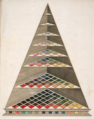 |
Image from http://www.uni-mannheim.de/fakul/psycho/irtel/colsys/Lambert.html |
Another graph that captured my attention was this 1782 "Tableau Poléometrique" by Charles de Fourcroy, where he compared demographic properties of European cities in what looks like an early predecessor of the treemap:
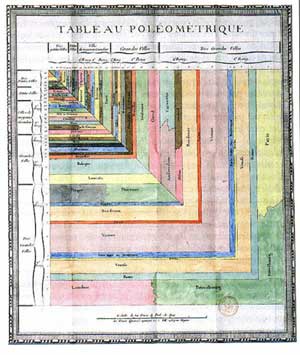 |
Image from http://www.math.yorku.ca/SCS/Gallery/milestone/sec4.html (full size) |
The following is a beautiful graph by W. Playfair, where he compares three parallel time-series: prices of wheat, wages, and the reigns of British kings and queens. Although it's too small to decipher the text, contemporary readers will have no trouble reading the graph itself:
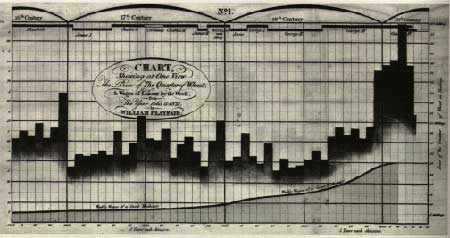 |
Image from Edward Tufte, The Visual Display of Quantitative Information, Second Edition, page 34. |
As you're following the timeline you'll see that graphs get more abstract while they gradually step away from displaying physical properties, and start displaying abstract numerical data. The following graph from Louis Ézéchiel Pouchet allows multiplication of numbers by overlaying a third dimension onto a two-dimensional coordinate system:
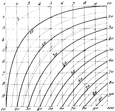 |
Image from http://www.math.yorku.ca/SCS/Gallery/milestone/sec4.html (full size) |
And it goes on and on. Take a look at the Milestones site, or even better get Tufte's book, and see for yourself; there are some amazing ideas for visualizations of abstract concepts. And it's also really interesting to see how closely linked the development of data visualization is with the development of statistical analysis and economic systems.
Links
- http://mardoen.textdriven.com/dienstag/2006-01-17/dataviz/, a more detailed overview (some text in German)
- http://www.math.yorku.ca/SCS/Gallery/milestone/, Milestones in the History of Thematic Cartography, Statistical Graphics, and Data Visualization
- http://www.karlhartig.com/chart/chart.html, a great portfolio of well-designed charts and other visualizations: U.S. Population Changes, Percentage of households using consumer electronics products from 1920 to 1998, Charting 100 years of the daily Dow Jones Industrial Average, Events and the economy contribute to people's opinions about president, consumer purchases by type of music and type of media, ...
Comments
Comments are closed. You can contact me instead.