 |
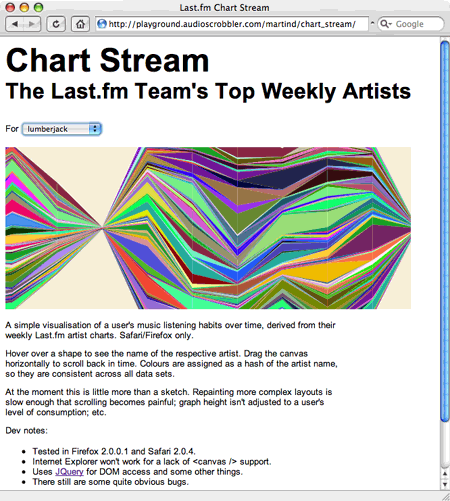
A simple visualisation of a user's music listening habits over time, derived from their weekly Last.fm artist charts. Safari/Firefox only.
The visualization concept is based on the gorgeous work Listening History by Lee Byron.
See also part one: Chart Arcs.
Comments
Comments are closed. You can contact me instead.